- August 24, 2021
- Karolin Koestler, Senior Marketing Manager EMEA

Your app or website is used by someone who has a specific goal they’re trying to achieve. A form is often the only thing that stands between the user’s goal and realizing it. Users still use forms on the web and in mobile apps as one of their most essential interactions. With all this in mind, your PDF forms should be easy to use and understand by users.
This article offers you a few best practices for using fields in your form design. When used correctly, these techniques allow designers to create faster, more efficient, and more productive form experiences.
The field’s length determines the range of answers. This is useful for fields with a fixed character count, such as zip codes or phone numbers.
When asking for phone numbers and birth dates, don’t cut fields.
Field slicing can lead to problems, even if users are automatically advanced onto the next field.
It’s better to keep one field with clear formatting guidelines in the placeholder.

As you can see, field slicing could cause confusion for anyone entering a number from outside the United States.
To reduce the field entry when asking for addresses, you can use a zip code or post code lookup
It’s best to ask users for their address and to then use a lookup tool to find the complete address. This helps limit the amount of information you’re requiring users to type.

The input fields should be appropriately sized
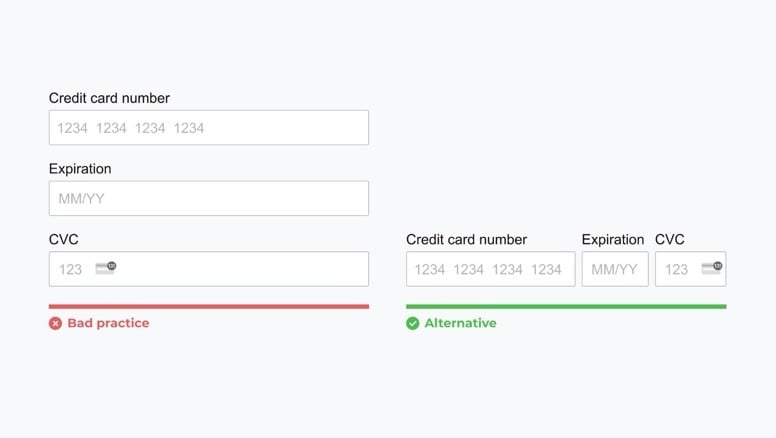
The field’s size should be proportional to the amount of text that is expected to be entered. Fields like zip code and house number should have a smaller width than fields like address line. This is useful for fields with a fixed character count, such as zip codes or phone numbers.

Use field types that require fewer clicks to complete
It’s amazing what just a couple of extra clicks will do. Microsoft switched their shutdown prompt from a clickable icon to a dropdown option. They found that people were shutting their computers down less often because they had two more clicks.

Try to optimize for as few clicks as possible when choosing the question field type you want to use. Because, as you undoubtedly know, when it comes to forms, less is more.