- February 16, 2024
- FOXITBLOG

If Shakespeare were on a marketing team today, he’d say: What’s in a brand logo? To which the reply would be – that all the standards, intent, and themes of a brand are contained within its logo. Also, it helps if it looks pretty awesome, too.
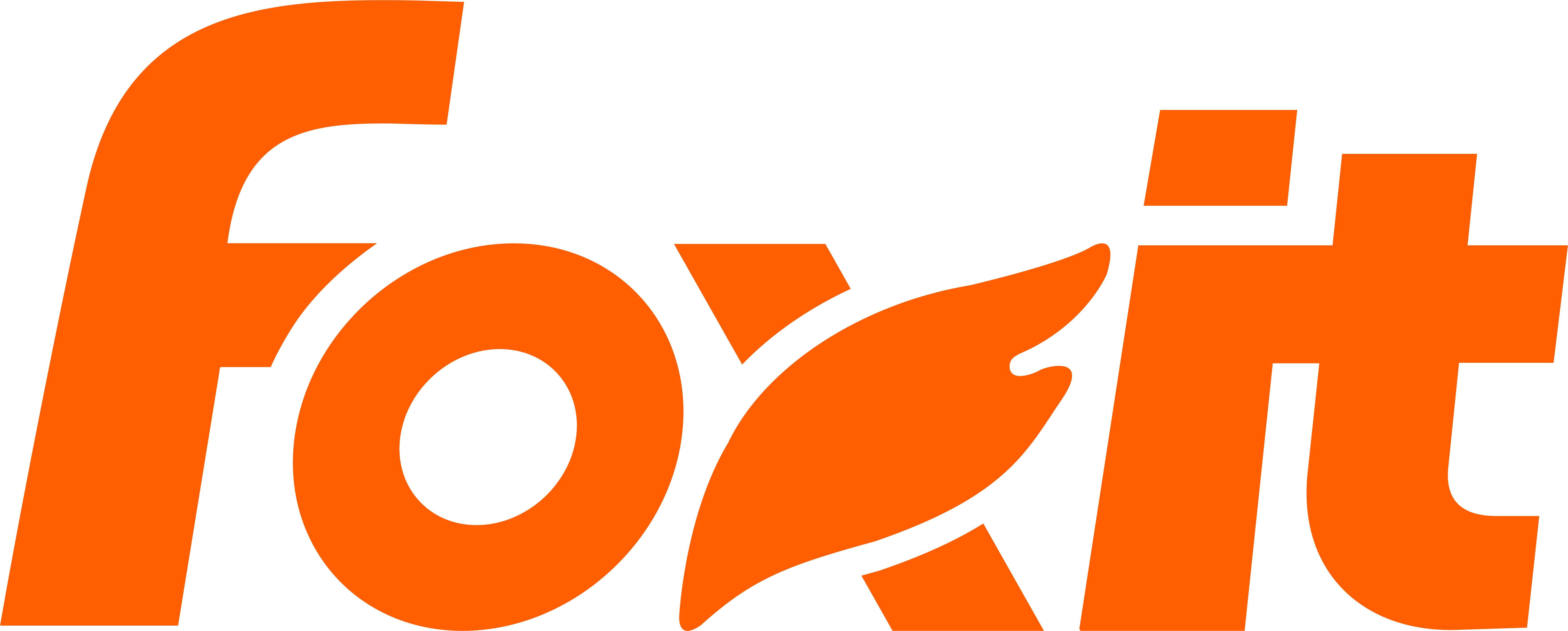
Foxit is no different. We recently underwent a logo update because our previous logo no longer reflected our brand properly. Foxit aims to deliver an intelligent document platform that is unrivaled in its category. In our journey to do that, we are elevating the fox, as we like to say. Foxit has our sights set on being synonymous with all things PDF. We achieve that by delivering a product that eliminates common frustrations and limitations haunting our competitor’s software. We achieve that by being the first PDF editor to integrate A.I. truly and completely into our suite. Simply put, Foxit empowers its users in new and powerful ways so that the teams using it can increase productivity and consistency across all their digital documents and for a price that only enhances its value.
Our approach to redesigning our logo brings us one vital step closer to achieving that goal.
This is why when designing a new logo, we didn’t simply commission something that is a neat and cool reflection of what a single designer can do. Our redesign was done to create a logo that adds brand clarity and visual distinction in an otherwise bloated PDF marketplace. The design process is not subjective in the way art is. Logo design is successful when it conveys the brand and symbolizes its stance. The creative process included exploring options across various themes that were influenced by design flexibility and overall actual functionality.
This is a fancy way of saying a new logo needs to pass the squint test, meaning if you squint, you still essentially make out whose logo it is. It might sound silly but try it for yourself with brands you know and see how often they pass the test.
The inspiration for our new logo is a Fox’s tail. A simple feature that most easily defines the real-world fox. Our logo reflects our company name, tying them together. See what we’re subtly doing there. – Fox equals Foxit. It’s more than that; we’ve taken inspiration from the quill. A classic writing tool even Shakespeare would recognize today. The fox and the quill abstracted and combined to build the core elements of our new logo. We then shifted the positional focus of the logomark from the “O” to the “X” to symbolize our continuity in the market. Adopting that more central position improves the balance and stability of the Foxit wordmark overall.
Our new logo is a reflection of our mission and core values of simplicity, clarity, ease of use, and innovation. It’s us looking forward as we aim to make Foxit the number one PDF editor on the market. Folks used to say “X” marks the spot, but we say it’s more like the Fox means PDF.